The austerity shortfall
A future Labour government will certainly wish to increase public spending. Howard Reed looks at where the extra money is most needed.
Ten years after the financial crash, the UK public sector is in a sorry state for the most part. A decade of austerity has left public services cash-starved, underfunded and increasingly threadbare. A future Labour government will certainly wish to increase public spending. But where is extra money most needed? And where is further spending restraint necessary, or possible?
One problem with establishing priorities for additional funding is the sheer scale of the cuts. Statistics from the UK government’s Public Expenditure Statistical Analyses (PESA) publication show that between 1996/97 (the last full year of Conservative Government before Labour was elected in May 1997) and 2009/10 (the last full year of Labour Government before Labour left office in May 2010), UK public expenditure on services in real terms (in 2016-17 prices) increased from £438bn to £715bn. If this rate of increase had continued after 2010, by 2016/17 (the most recent year for which full figures are currently available) public expenditure on services would have been around £930bn. In reality, expenditure on services was £710bn – a real-terms fall of £5bn over eight years. The difference between £930bn and £710bn is £220bn, which I call the “austerity shortfall” – the extent to which the austerity programme of post-2010 governments has reduced spending relative to underlying trend growth in spending.
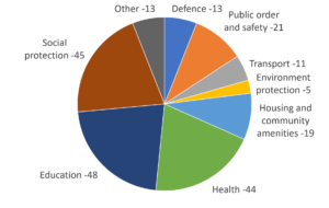
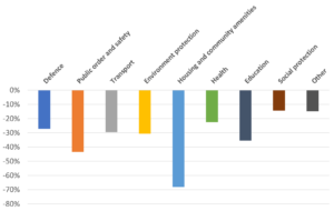
Looking at spending across the UK as a whole, again using the PESA data, we can decompose this shortfall into various different types of service using the United Nation’s COFOG (Classification of Functions of Government) breakdown. Figure 1 shows the composition of the shortfall in terms of which types of service have suffered the biggest cuts in terms of billions of pounds compared to spending growth before the crash, whereas Figure 2 presents the austerity shortfall as a percentage of what spending on each service would have been in the absence of spending cuts.
Figure 1: Composition of the austerity shortfall, 2016-17 (£bn)

Figure 1 shows that the largest austerity shortfalls by spending category are for education, health, and the “social protection” category – which includes transfer payments such as benefits and tax credits, and social care spending. Given that analysis of the OBR policy measures database shows cuts to social security benefits of £25bn by 2016-17, we can assume that around £25bn of this is transfer payments with the other £20bn being cuts to social care. The next two biggest shortfalls are in public order and safety (including police and fire services) at, and housing and community amenities at.
Looking at the austerity shortfall in terms of percentages for each service category, in Figure 2, shows a different pattern of results. Measured like this, the largest shortfalls in spending are for housing and community amenities (where the shortfall equals 68% of total spending), public order and safety (44%) and education (36%). Shortfalls for health and social protection, while large in cash terms, are smaller as a percentage of total spending on these services than in the other categories.
Figure 2: Composition of the austerity shortfall, 2016-17 (% of spending on each service)

What does this analysis mean for what a future Labour government’s spending priorities should be? In terms of where to spend the most additional resources relative to current budgets, I would argue that Figure 2 is the most instructive, because it shows which spending areas have been the most starved of additional cash in the era of austerity relative to the pre-crash period. Housing and community amenities, in particular, have suffered a catastrophic fall in funding of over two-thirds, and reversing at least some of this has to be a priority. The large shortfalls in spending for public order and safety and education also reflect the increasingly parlous condition of police forces and schools across many parts of the country. By contrast, the shortfall in spending on health and social protection, while substantial, is smaller in percentage terms (although very large in cash terms). The media’s focus on the crisis in the NHS might lead us to believe that health spending has been the main casualty of austerity, but Figure 2 shows that housing, police and education services have suffered even greater restraint.
Four other points are worth making here. First, these are UK-wide figures and do not take into account differences in spending priorities for the devolved administrations in Scotland, Wales and Northern Ireland. Ideally an exercise of this type would need to be conducted separately for each country to see where the biggest shortfalls in each country are. Second, at the local level within England there has been a huge redistribution of spending from relatively deprived areas to relatively affluent areas, largely as a result of the current government’s decision to phase out the revenue support grant to local authorities, meaning that they need to raise all their funding from local taxation by 2020. Reintroducing revenue support grants – to reverse a catastrophic decline in funding for local authorities in the poorest areas – needs to be a priority.
Thirdly, the crude cash shortfall comparisons presented here are not the whole story; cuts to spending have human consequences which are devastating in some cases – for example the DWP’s statistics on the number of benefit claimants who died after their claims were stopped, or the calculations of lives lost due to NHS cuts. The next Labour government will need to make a systematic appraisal of the impact of spending cuts on wellbeing and human suffering to reach an informed decision on where the extra money should be spent.
Finally, it is important to remember that Figures 1 and 2 show the shortfall arising from austerity measures since 2010 relative to pre-2010 spending trends. Between 1997 and 2010 Labour increased funding for some spending areas – particularly health and education – relatively fast, whereas others – for example social care – received much smaller increases. So the percentage shortfall for social care spending (which is in the “social protection” category) looks a lot smaller than for education spending, but given that social care was already facing a funding crisis even before austerity started in 2010, Figure 2 understates the extent of the operational shortfall in care funding. So it is important to take account of longer term trends in the generosity of the funding settlement when deciding where to spend additional resources, and the case for extra funding for social care is actually much stronger than might appear to be the case from these charts.

